As most of the content is text, the grid proportions must be as per the type. Think about it, how you can know where the design break is in case you have not settled on a font, its measurement, height, and size?
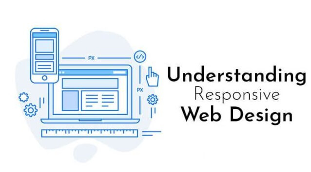
The pervasiveness of the mobile devices in today’s era means that the audiences wish to consume the content on whichever device or browser they prefer. Thereby, publishers and web designers have supported the concept of Responsive Web Development so that they can easily reach out to an extensive range of audience as well as promise the best experience to readers irrespective of the screen size. But in the rage of making websites work well across many tablets, desktops, and mobile devices, a lot of people have underestimated a critical concept i.e., we must be designing for the device, not the reader.
Why the responsive web design is so significant ?
It is important for designing your site for a variety of devices, but it becomes more complicated when it comes to designing across different web browsers. Every crucial web browser possesses its mobile version as well as renders the websites differently. This gets trickier as there are plenty of browsers’ versions that are required to be catered for as you cannot expect everyone for being on the current version. That is why your web design must work as well as respond to the range of browser versions.
In case we developed and designed a website’s countless versions that worked for each known device, the procedure would be extremely costly and not time-wise practical. Also, it would render websites ineffective to future changes in technology and make the same almost impossible to retain. Responsive web design is an efficient solution for making your website future-proof. No standard site size is out there as plenty of devices are available in the market, and screen resolutions, as well as model sizes, keep changing all the time. Moreover, every individual site appeals to users on different devices.
The responsive site design must have a minimum of 3 layouts for distinctive browser widths. Please note there is not any hard-and-fast rule to follow the below-mentioned layouts, but it would be suitable for you to keep these in consideration –
- Small i.e., under 600px.
- Medium i.e., 600px-900px.
- Large i.e., more than 900px.
Things to keep in mind while opting for responsive web design :–
- Do not design your site for the current mobile device with a particular screen dimension. Rather, design your website around the content. Consider these questions in mind – how will the elements and layout work on the desktop as well as how will those elements adjust to each other on the mobile device?
- The flexible images are extremely important for designing a responsive site. You should think about the fact that how the image will scale. How it will look on the huge desktop screen v/s the small screen of your mobile v/s the tablet? From the development perspective, code will permit the images for scaling through the percentage value to the browser window’s width.
User experience is a must because the responsive design is required to be more than just converting the desktop site into the mobile screen. You should consider the experience of the user, their interaction as well as the vital content they are looking for when using the mobile device.


